Dive deeper into this episode with exclusive sketches, production designs, and fun facts delivered directly from the Outlander crew.
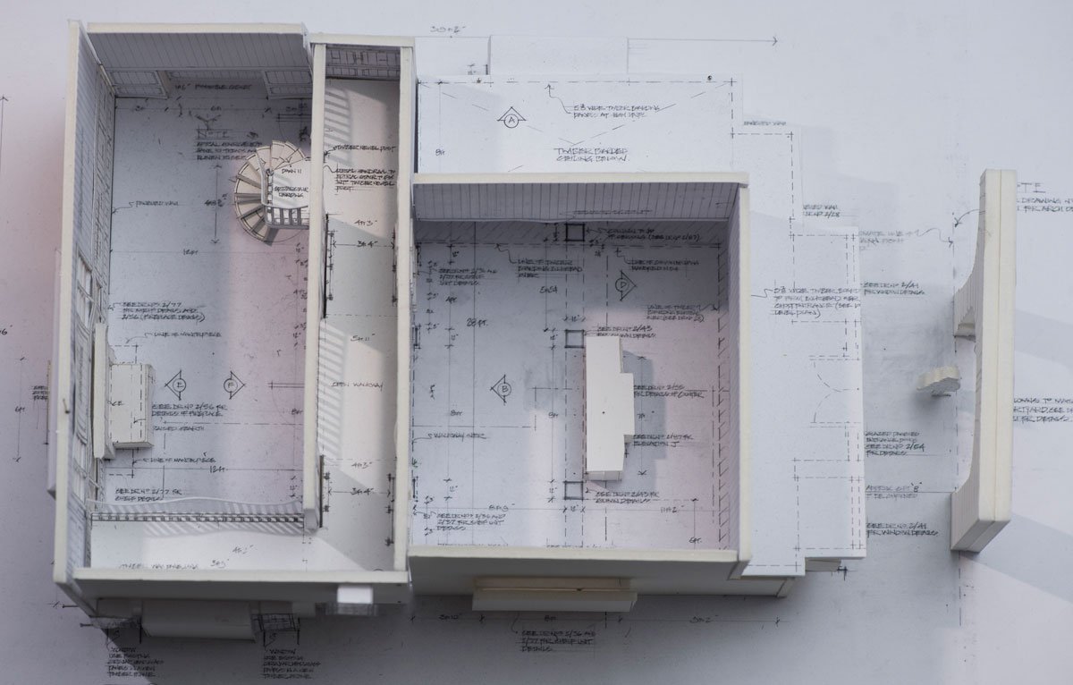
Master Raymond’s Apothecary Shop


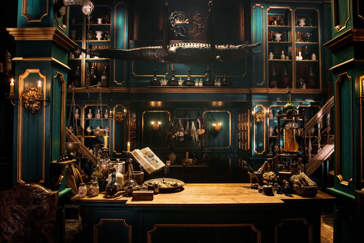


“Through design with shape, color, shade and shadow and exotic set dressing, we tried to create something that was more than just a shop in Paris. I wanted it to feel a bit mystical and magical. The walls were covered with symbols of alchemy and magic. Research of 18th Century apothecaries show etchings of shops with an alligator hanging above the counter; this was the period of enlightenment and people were fascinated with all things foreign and exotic. Gina Cromwell, our Set Decorator, filled it with thousands of amazing things.” –Jon Gary Steele, Production Designer

“Master Raymond’s was in fact the third apothecary we dressed on the show. In Season One, we had the old apothecary at Castle Leoch and the work room in Geillis’ house. The big departure with Master Raymond’s shop was it had to be more business-like and sophisticated to serve the Parisian people, but retain the same magical quality which we explored in the earlier apothecaries.”


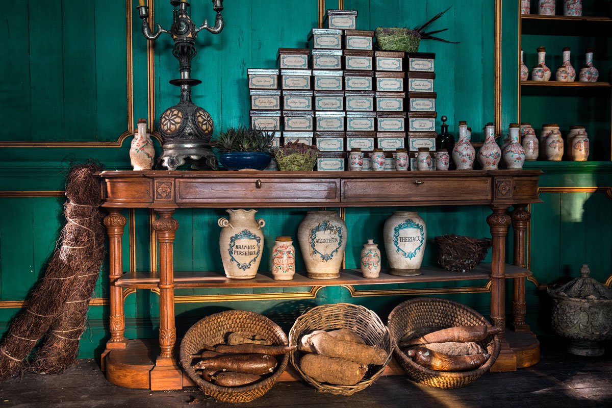


“The wonderful dichotomy of this set is it has the formality of a dispensing pharmacy of today, with all the pots neatly arranged and the medicine being measured and carefully wrapped, but with a strong flavour of alchemy and old wisdom, as demonstrated in the old mystical Crocodile, the fire from the still and bubbling alembics, the drying herbs, and the weird stuff in jars.”
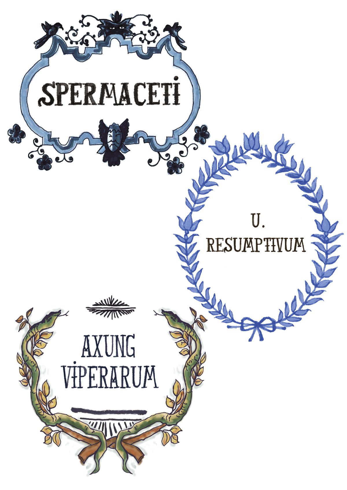
“There’s no one prop that makes this set come alive. It’s an orchestration of hundreds of individual pieces which the set decorating team collected over many months. We had the apothecary jars made by Trinity Pottery, who work with many British museums. The glass was either blown by Georgian glass blowers or gathered from endless shopping expeditions, digging around in antique shops and scouring the internet. We hired many weird and wonderful things from London and Parisian Prop Houses. The Crocodile is an antique piece of taxidermy from London.”
“The herbs were sourced from Chinese supermarkets or cut from medical herbalists’ gardens. We were lucky to find some large aloe vera plants busting out of their pot just like in the Pietro Longhi painting of “The Apothecary” from 1752. The way we approached the preparation for this set was to immerse ourselves in paintings and illustration from the period, showing Apothecaries and alchemists at work.” –Gina Cromwell, Set Decorator
This poem also helped set the tone for an apothecary in the 18th century: …Here mummies lay, most reverently stale, And there the tortoise hung her Coat o’ Mail; Not far from some huge shark’s devouring head The flying-fish their finny pinions spread. Aloft in rows large poppy-heads were strung, And near, a scaly alligator hung. In this place drugs in musty heaps decay’d, In that dried bladders and drawn teeth were laid. –Samuel Garth

Louise’s “Cuckoo Clock” Dress “We had to make special mannequins for Claire Sermonne who plays Louise de Rohan, because her waist is so tiny. It became a lovely feature of her costumes.” –Terry Dresbach, Costume Designer


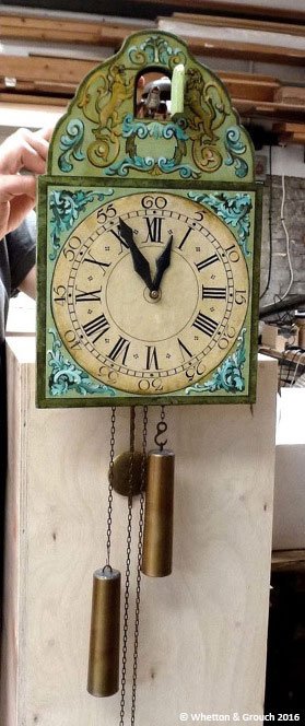

Prop Spotlight
Louise’s Cuckoo Clock “Our research showed that the traditional German carved cuckoo clocks we’re familiar with today didn’t exist back in the 1700s… so our set decorator, Gina Cromwell, and prop makers at Whetton & Grouch in London designed and made an authentic one. It rocked!” –Toni Graphia, Executive Producer and Writer
“Research we did for the cuckoo clock came up with the “painted-shield style” of that period and we found images from several German museums as reference. Gina bought a replica online which was a little too small and a bit too much like a tourist souvenir, but very useful as we were able to take it apart and use the basic pendulum mechanism.”
“This had been quite difficult to understand from 2D illustrations! It was incorporated into the final prop with other references we found for the detail of the cuckoo and striking bell. The mechanism had to be adapted so that the striking and the bellows could be hand operated from behind the set.”
“Gina also sent images of the set wall colors to determine a color palette for the front of the clock. The design for this was based on the original museum clock, but needed to look like it had been recently made and the colors also needed to reflect the personality of Louise. We are always quite keen to use real materials where possible for these detailed props.” –Karen Grosch of Whetton & Grouch.